


It’s Winter time with Controversa!
Christmas and its many interpretations.
Different styles, unmistakable features, essential solutions to make every delivery special.
Our proposals to evoke all the sensations that only a magical season like winter can give. All you have to do is choose!
We are doing it again! This season Controversa proposes a new selection of boxes, in different sizes, designed for all those small-medium companies and consumers who share a single desire: finding an exclusive look for their shipments or gift packs. For each box, we have provided tissue paper, coordinated with the chosen graphics or interior color, a paper bag optimized for shipping and a postcard with assembly instructions.
The perfect kit for the perfect gift.
Colors by Controversa
A selection of colors in palettes, and a mix of textures between matt and metallic for the chic-est season of the year. Colors that evoke tradition, but also some more irreverent interpretations.
Gold, Silver, Rosa Gold: papers and cardboards made with ECF (Elemental Chlorine Free) pure virgin cellulose fibers, colored in the pulp and finely coated with pearlescent pigments. The most striking feature is the multi-colored surfaces with unusual pearl, metallic, iridescent effects that vary in color depending on the viewing angle. Ecological characteristics: FSC® certified, recyclable or recoverable as energy.
Sirio Cherry, Leaf Green, Nude: natural papers and cardboards, FSC® certified, made of pure cellulose e.c.f. Colored in the mass with very light-resistant pigments.
Patterns by Controversa
A selection of patterns that outline the coziest time of the year with magic and irony. Our way of collaborating with the world of illustration to interpret this season with colors and sensations.
Red Tartan - Tassotti Paper: exclusively produced by Tassotti printing house in Bassano del Grappa.
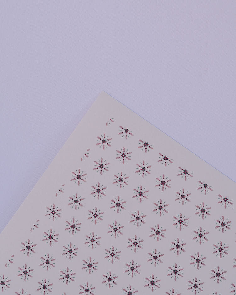
Controversa Christmas pattern: Controversa dresses up for Christmas without giving up to its colors, white, pink and green.
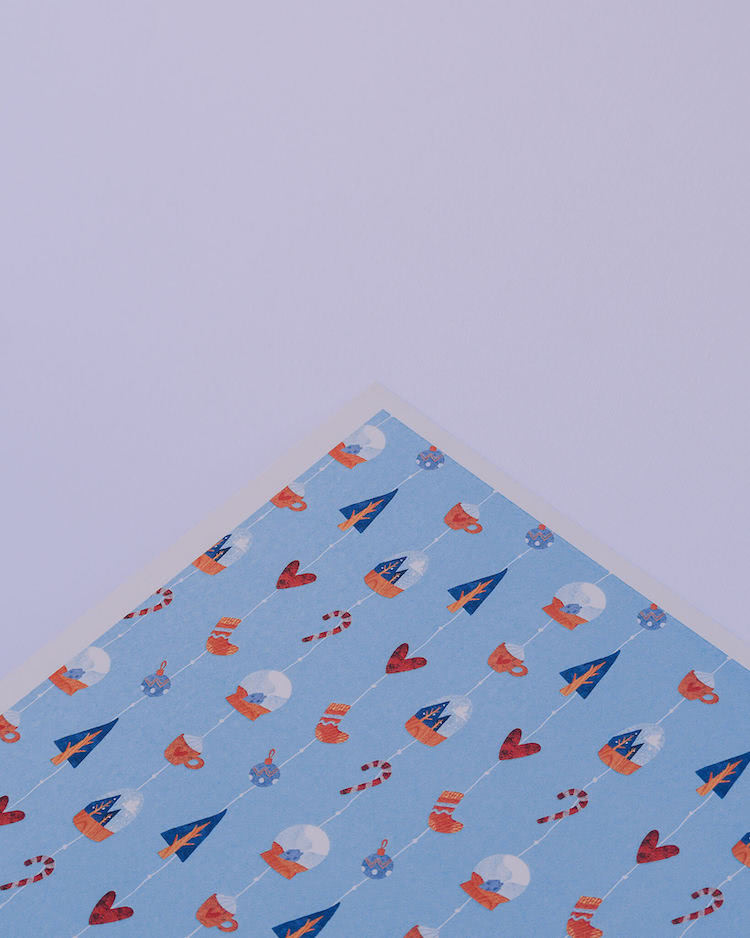
Chiara Varotto - Scende leggera (It glides lightly): the illustrated vibration of the first snow of the year, the one we admire coming down, cuddled by the warmth of our home. A pattern that speaks of winter and the festivities, recounting them with sparkling light-heartedness and a touch of nostalgia.
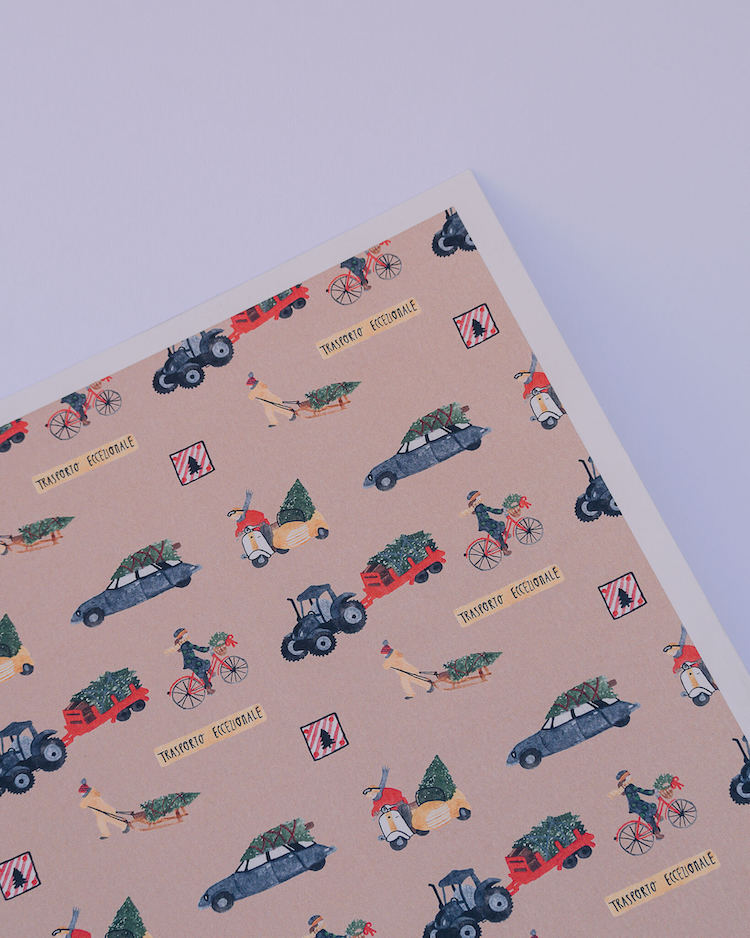
Silvia Benedet - Trasporto Eccezionale (Exceptional Transport): an ironic and amusing interpretation of Christmas Day. All the typical moments of this period require exceptional, emotional and real transport.
Silvia’s narration is a (month-long) journey: the “anxious” wait for December 25th.
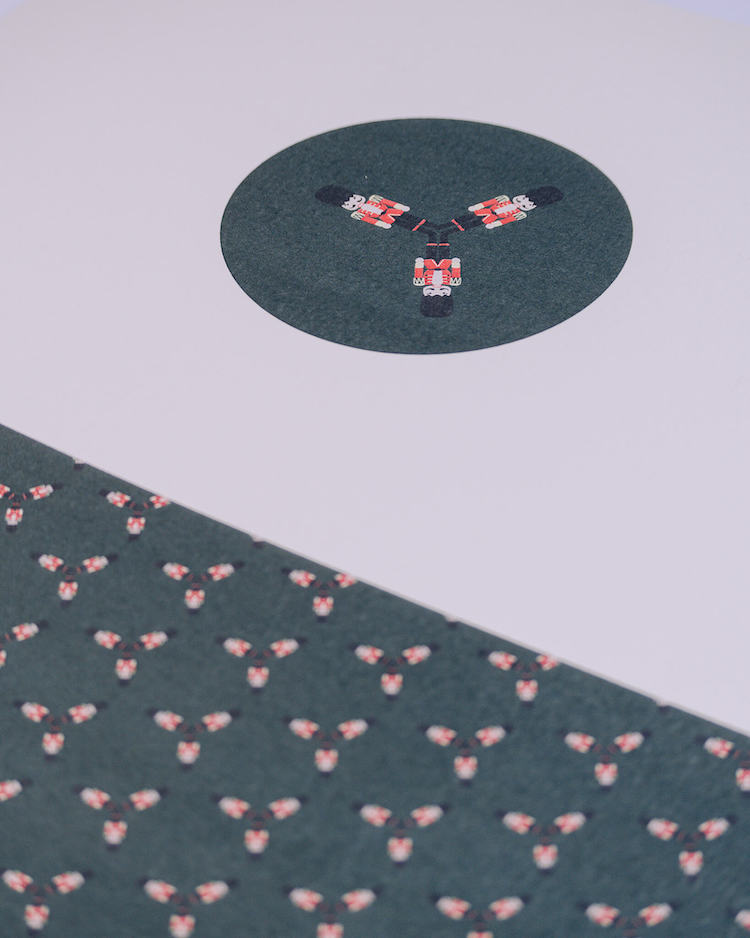
Da Sola Stories - A Prima Vista (At first sight): their textures for Controversa are a journey of discovery of typical features and colors of the period, which tell a very different story whether you look at them close or far. "Nothing is as it seems" could be the subtitle of this story: at first sight, definitely Controversa style.
More articles


